
Book Review: The Hockey Stick Illusion
Book Review: The Hockey Stick Illusion
What was the initial controversy in climate science all about

What do you think is the most polarising topic in the United States. The “Black Lives Matters”, “Terrorists”? Donald Trump Presidency? Abortion? Gun Control? Taxes? “Nazis were the good guys”? Well it turns out that it might just be the Science incorporated’s “Climate Change”, probably after Trumps presidency. Almost 90% of democrats agree it is a serious problem while only 30% of Republicans agree, thats a larger differential than Abortion. Take that Vatican!, though I suppose if you give it enough time and the Vatican too should start supporting Abortion, (only in limited circumstances at first of course). I predict the government will remain paralysed regarding Climate Change unless a Democratic super majority is obtained (Republicans first try to win the popular vote, or disenfranchise large swaths of the voting population), but back in the 2000’s climate change wasn’t so hot button a issue with Romney and Obama both agreeing that it was a serious problem. It is in this background, that the above book was published arguing that Climate Change Hockey Stick Graph paraded by Al Gore, IPCC and the Science inc, community is just flat out wrong and shouldn’t be the basis for any policy decisions. TLDR; the book is right, the hockey stick graph is wrong and there isn’t any way to salvage it unless new measuring technologies are developed. If you want to know more details regarding the fiasco, keep reading below:
The hockey stick purports to show the global temperature of the Earth from 1000 AD, possibly earlier to the present date. The original graph which caused a huge climate scare and hysteria is reproduced below:

The key point to note in the graph is that we have instrumental data from only 1900 or so, that too mainly in the United States not in the entire Earth and everything else is in fact a Guesstimate. So the question really is how accurate is the guesstimate. Already this question seems a bit fishy. How can we ever judge the accuracy of this guesstimate? Its like trying to judge the accuracy of M and M’s in a bowl without being allowed to count them. We don’t know the ground truth. How can one guess be better than the other with nothing to compare them to?
Well what “Scientists” decided to do, is to use what was called proxy measurements that track temperatures. A common such proxy is the number of rings in the bark of a tree, it is known that wider rings exist in a higher temperature, another proxy is ice core estimates, another can precipitation and so on. The ideal solution is of course, to find the most accurate proxy and use it to estimate the past temperature. In an incredible feat of imprecise magical thinking, that I’ll come back to in a bit, Michael Mann one of the chief architects behind the Hockey Stick Graph, decided to combine all the known proxies in a weighted average, to give out the “true” reconstruction of the past temperature. To get an understanding of the scale, in the original paper around 300 series were used, which was further compressed to 112 series using Principal Component Analysis (An unsupervised technique that finds main patterns in a dataset). So a statistical mix of these 112 series, is what has caused the shape of the Hockey Stick. This is clearly a wrong approach, easily amenable to manipulation that can be exploited by an unscrupulous scientist which is exactly what happened. How do the tree cores generally do, well for that we can use the quotes by a climate scientist known as Keith Griffa who pointed out that,
“Twentieth Century Ring Widths hadn’t gone up alongside warming that had been seen in the instrumental record.”
So already we see an admission that tree widths aren’t a great proxy. In an ideal Scientific Institution, or Market of Ideas, scientists would try to search for a new proxy that seems more plausible but unfortunately we don’t have such an institution. In this case Michael Mann, decided to see if he could combine 200 different proxies to get the result he wanted. Steve McIntyre the primary skeptic and nemesis if you will of Michael Mann, first came across this statistical malpractice when he was trying to recreate Mann’s results. Steve was a climate skeptic regular who was studying climate modelling at the time and corresponding with other skeptics on online forums, when he decided to take a checkout the Hockey Stick Graph. Coming from a statistics background from University of Oxford and applying it to determining the potential of Mines in Canada, he clearly expected a much higher degree of professionalism and transparency than was present in the Scientific Community. Unfortunately, the situation has only gone worse since then in many fields but that is for some other post. Steve gains access of the 112 time series data and then discovers that very few of them actually have a hockey stick shape. As the book notes:
After loading up the data into a spreadsheet McIntyre plotted all 112 series in separate graphs. In this way he hoped to be able to see clearly which series were driving the twentieth century warming in reconstruction. He quickly noticed that the more prominent anomalies were coming, not from the multiple individual proxy series, but from the PC series where multiple proxy records had been summarised to stop their geographic area from being overrepresented. This didn’t quite seem right: if the output from the PC analyses showed significant twentieth century warming (i.e. wider tree rings) then the tree ring series that went in as raw proxies must have shown the same warning too. But why then did the other proxies show nothing of the sort?
Just 13 of the 112 series did in fact have a hockey stick shape. 12 of those were in fact PC of multiple series, only one of them was actual proxy data. A single tree from Gaspe Quebec had a hockey stick graph when plotted. Even if this tree tracks temperatures exactly (it is unfortunately a proxy), that only indicates the temperature in Quebec, hardly the entire Earth. Already this technique opens itself to multiple in arguments in reconstructing past temperatures but let us go till we fully understand Mann’s graph. Recreating Mann’s graph was hard because standard PC Analysis simply didn’t reproduce the same results that Mann produced.
McIntyre was still chipping away at the apparently intractable problem of trying to replicate Mann’s PC calculations. It seemed that no matter what he did, he just couldn't produce exactly the same results as Mann - he was close, but there was still something missing.
Later Mann’s code was uploaded online, and McIntyre finally got to peek to understand what was happening. Mann was doing his standardisation incorrectly. Generally when you have a dataset you centre it to 0, by subtracting all values by it’s mean and standardise its variance by dividing all values by it’s variance. Mann did the same thing, except he subtracted the series by the mean obtained between till 2000 only, ignoring any data that came after 2000. What would this cause? assume there exists a series that spikes after the year 2000. If you used the entire mean, then you would centre the data around 0, if you used the mean only till 2000, your new series would basically exaggerate the spike that appears after 2000 (Since the total mean would be a much larger value for the entire series).
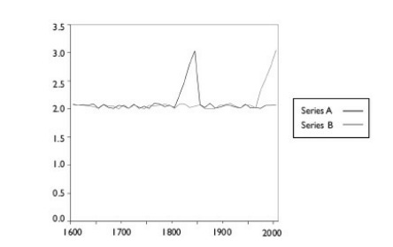
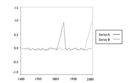

As you can see Series B, hockey stick graph gets accentuated while Series A isn’t all that affected. In the spirit of fairness I don’t want to ascribe motive to Dr Mann, but whats done here can be most charitably explained as a mistake and uncharitably as a deliberate trick to obtain the results you want. There is no justification for this. Now if a bunch of series are standardised in this wrong way, which we can call “short-centering” then the series with a Hockey Stick shape (up or down), will end up with a magnified variance, which when put through PCA analysis will create a highly weighted Hockey Stick Graph (as PCA searches for patterns of highest variance in the data). To definitely prove that what Mann has done is wrong, we need to show that no hockey stick graph appears without this short-centering and that random data will create a hockey stick graph when such a technique is applied. Steve McIntyre proceeded to show exactly that. First McIntyre discovers that that one tree in Quebec was used in both, the reconstruction and one of the PC series. So two hockey sticks like that are easily created
Since making that observation McIntyre has discovered that the series had actually been used twice in the paper. It spread once in the NOAMER PC Series and once as a single proxy.
Then Steve discovers that using red noise he could recreate the hockey stick graph. He used noise with similar characteristics to the existing data, however none of them had any hockey stick components.
To make absolutely certain he had headed off any potential objections, McIntyre was careful to ensure that the red noise had the exact same characteristics as the noise in tree ring series actually used in MBH98. And when he fed the results into the Mann PC routines - bingo! Hockey Sticks Appeared.
So noisy data leads to hockey stick, because short entering accentuates the variation of any hockey stick graph (which can appear in pure noise) and then PC Analysis heavily weights it, leading to a hockey stick reconstruction. To further see what it would take to not get a Hockey Stick Reconstruction:
The implications of this discovery were enormous. Not only did Mann’s northern Hemisphere reconstruction depend largely on just one of it’s PC series, namely the first PC from the NOAMER network, but the shape of the NOAMER itself depended on just a tiny selection of trees from once corner of the western USA. They were all from two closely related species - bristlecone pines and foxtails - and all had been collected by a single researcher, Donald Graybill. What made it much more problematic was that Graybill had stated that the twentieth century growth spurt in these trees had nothing to do with temperature changes. He hypothesised that trees instead contained signals of 20th century CO2 fertilisation. The Hockey Team itself ( Note: A bunch of scientists who supported the Hockey Stick including Mann) had agreed that the Bristlecones were not indicators for temperature. In an article in 2003, Malcolm Hughes had described their 20th century growth spurt ‘a mystery’ and the team apparently adjusted for this in MBH99
There you have it, the entire reconstruction depended on a single tree species in North-Western USA, if there was any pretence that all the series were being combined to get the best combination, that has been lost. Removing this tree, removes the hockey stick entirely.
In other words Mann had created a revised NOAMER PC calculation which excluded all sixteen of the Graybill sites listen in table 5.1. By doing this, Mann would remove the few hockey stick graphs from his database. The rest of his data series, however, amounted to little more than noise, which meant that they would not be picked up by the short-centering algorithm. As a result the hockey stick shaped disappeared from the NOAMER PC-1 and in turn from the final temperature reconstruction. But he (Mann) didn’t report these findings in his paper.
So Mann himself knew how his method was flawed, and chose not to inform it which isn’t surprising and is something many scientists do these days. But Mann’s technique itself seems much more like hunting for hockey sticks than any valid process. These sorts of discoveries led Steve McIntyre found to create the hilarious blog post The most influential tree in the world. Here we have the crux of why the MBH98 (for the year 1998) hockey stick graph is fundamentally flawed. Finding a replacement graph is hard because none of these proxies really give much confidence to match temperature data. However anecdotal records show that there existed a medieval warm period filled with droughts that was quite warmer than present day temperatures, though this too isn’t really provable. Apart from this, the book lists a litany of problems with the proxy dataset itself such as:
The dates of the data were arbitrarily tampered with. Such as Australia-NewZealand data series went till 1625, instead Mann used data only from 1750. Why? Texas-Mexico data went back till 1760, Mann used data from 1400, so he extrapolated 400 years of data from 220 years of data. The nine PC’s of Texas Mexico had the 1980 values to be exactly same, to seven decimal places, indicating a copy paste.
Similar copy pastes occurred in 9 PC Series from ITRDB and 3 PC from Vaganov.
Infilling was also occurring, since proxy number 45 had same values from 1978- 1982. Series 51, 52, 54, 56, 58 had same problem. Same for 93, 94, 95, 96, 97, 98, 99 and 6.
Series 50 had its entire values from 1962 - 1982 from Series 49. McIntyre on digging discovered that while Mann attributed both 49 and 50 to a study by Fritts and Shao, Series 49 was in fact from a different study by Keith Briffa.
Series 10 and 11 from CETR didn’t match with the original publicly archived record. Why? Because CETR data used the average of June, July, August for each year, while Mann was trying to create a Full year average.
Arbitrary truncations in the data appeared. Mann used CETR data from 1730 only, while it started in 1659. It is hard to understand why? A cynical observer might notice that 17th century numbers were distinctly cold, so this truncation would flatten out ice age. Similarly another set was truncated to 1550, hen it started at 1525. Here the warmest part of the series was removed. These truncations were neither disclosed nor justified.
Two precipitation series (another proxy) which Mann said were from India, actually definitely weren’t from India but likely from Philadelphia.
And last but not least Series 20, an ice core from Greenland was dislocated and series 46 and 47 had their locations swapped
This shows quite a sloppy attitude towards the paper, and while these issues didn’t matter as everything mainly depended on the Bristlecones anyway, they however don’t paint the scientists in a great light.
To drive the point home, McIntyre performed 10,000 simulations and discovered that Mann’s technique delivered a hockey stick from this random data 99% of the time. He then went to a poster session to American Geophysical Union (AGU) in San Francisco and showed 12 hockey stick graphs, 11 of which were generated from red noise and one from real data. He proceeded to ask anyone who appeared to guess which one was from the actual hockey stick graph, which the scientists weren’t able to do. Considering this biased technique, if you add that tree from Quebec and Bristlecones from North-West USA you get a pretty dramatic Hockey Stick that supposedly describes the temperature of the earth. Large sections of the book simply discuss the correspondence between Steve and Mann which was basically Passive Aggressive vs Accusatory. The two were talking past each other not agreeing on a single point and Mann’s behaviour was egregious enough that a mediator (Ian Jolliffe - One of the worldwide experts in PCA) observed that:
I started my original review by saying that I found merit in the arguments of both [Mann et al and those of McIntyre and McKitrick]. To rewrite this, I believe that some of the criticisms raised by each group of each others work are valid, but not all. I am particularly unimpressed by [Mann’s] style of ‘shouting louder and longer so [he] must be right’.
To try to defend his version of centering the data, another author Tamino who for some reason styled himself as Mann’s Bulldog (as opposed to a scientist I guess) who noted that:
Centering is the usual custom but other choices are still valid. We can perfectly define PCs based on variation from any origin rather than average. In fact it has distinct advantages if the origin has particular relevance to the issue at hand. You shouldn't just take my word for it, but you should take the word of Ian Jolliffe, on of the world’s foremost experts on PC Analysis, author of a seminal book on subject.
to which Ian replied
It has recently come to my notice that… my views have been misrepresented, and I would therefore like to correct any wrong impression that has been given…. An apology from the person who wrote the page would be nice
Jolliffe explained what he told in his book and presentations and even presented doubt if centering should even be done for temperature reconstructions.
The book then goes on to describe how McIntyre’s paper had become a part of DC politics with some republicans calling Mann for questioning followed by McIntyre. This involved the usual political nonsense which isn’t worth getting into, except Democrats accused Republicans of corrupting science. Democrats create their panel and Republicans create their panel. The republican panel concludes with the Wagner report that states Hockey Stick is false (Including subsequent defences from other authors which never fixed the core problem, only changed data). The Democrats panel concludes that there are merits to both sides of the argument. In the meanwhile scientists sign letters, Republicans give speeches for fundraising, not a single thing actually changes and the authors surprisingly expected a lot to change. There is also debate into which statistical measure is best appropriate to judge different reconstructions, Mann seems to use a rarer measure which isn’t studied well enough while Mann’s reconstructions fail on the most standard measures.
What is the strongest SteelMann case for Dr Mann and his Hockey Stick?
The data corruption is due to sloppiness. Short-centering was a hard to detect mistake. The PCA reconstruction is wrong. What the actual temperatures were in the past is extremely hard to tell. Fundamentally Short-Centering is wrong, and the over dependence on just 1-2 data series that covers a small geography (Quebec and North West USA) to reconstruct the temperature of the entire Earth is non-sensical to say the least. Whatever happens to rest of climate change policy, surely the Hockey Stick graph must not figure into it, which thankfully seems to be the case.